
 I read, via Steve Rubel, that ABC News has relaunched its web site, with new features that allow citizen journalism. I think that’s a good thing, but it’s not what I want to talk about at the moment.
Steve notes that most of the comments on the relaunch concern the design of the page, as opposed to the citizen journalism features. I think that’s because most readers are concerned about finding and being able to read the content they want, while too many web designers are focused on the 37 pieces of flair (many of them ads) that get in the way of that content. Users don’t want scrolling news tickers and they don’t want fancy, slow loading pages.
Here are just a few of the negative comments users made to the ABC News redesign:
It stinks. Every page is slow-loading, even with cable internet. The look is cramped and cluttered. Browsing through headlines takes forever, due to the necessity to constantly switch pages.
***
Why can’t you just leave it the way it was. So simple, you just opened it up and picked the head line you wanted to read. Now it’s like everybody else, you have to search and decipher everything before you can find what you want.***
I liked the simplicity of the old design and used it as my home page. Did the designers/developers of this new format get ANY input from users in the 35+ age demographic?
It’s pretty easy to tell what readers want. It’s harder to explain why web designers refuse to give it to them. One reason is because the more page views it takes to get to and through a story the more ads get served in the process. People realize that ads are the price of admission, at least where old media web distribution goes, but there are limits.
Readers will ultimately refuse to click through 5 pages to read one article. They’ll simply find someplace else where they can get the content with less hassle, or they’ll move to an RSS reader.
There are two other things users want.
 One, for the page to display properly on their screen, regardless of monitor size or resolution. It’s not an 800×600 world any longer. Some pages that display fine at lower resolutions get jumbled up at higher resolutions, or when you increase the text size in order to read the type. The ABC News page seem to handle increased text size pretty well. Morningstar, one of my favorite destinations (DISCLAIMER: I have been a shareholder since the IPO), doesn’t. Bump your text up several notches and things get jumbled, ads overlap content, things get cut off, etc. I’m not sure how to address this problem, but it should be addressed, since many users cannot read the micro-text that results from a higher resolution and must increase the text size.
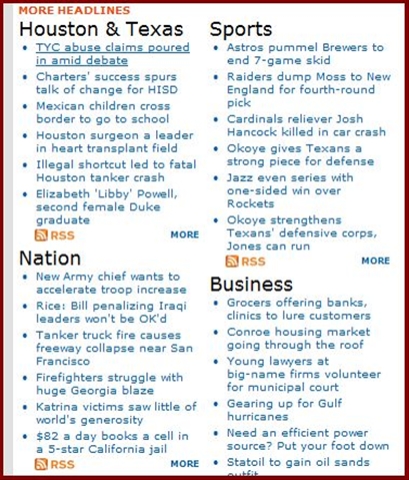
Morningstar is not the only offender here, many other major destinations have the same problem. ESPN‘s navigation banner becomes virtually unusable if you bump the text size. I completely quit reading the Houston Chronicle page after recent redesigns rendered the text on the front pages molecular (thank goodness for RSS feeds). For an example of how to handle large text size the right way, see Wikipedia.
Two, for the pages to be designed in a way that allows you to find what you’re looking for. I have always thought the CNN page was far too busy- and so I don’t visit it much. At least the USA Today page looks something like a newspaper, which allows readers to navigate it something like a newspaper. Google News has the most usable design precisely because it has the least amount of bling. Techmeme rules the tech-related blogosphere for the same reason. Tailrank, which for a while was on the verge of bling-overload, seems to be moving back the other way, which is a good thing. Digg has a relatively simple and easy to navigate interface.
Compare those pages to Fox News, for example. My head starts hurting before it’s finished loading. I’m sure the bling imbalance has to do with the sort of media we’re talking about- TV being, sadly, almost entirely based on bling.
But web pages are not TV, and a cleaner, simpler interface is better for users. And that should be the benchmark for a good web page. 37 pieces of flair was funny in Office Space. It’s not funny on web pages.
