
After using Version 1.0 of my Content and Twitter Juggernaut Page for a couple of weeks, I decided it was time to knock it down and see if I could come up with something simpler and better. Among the areas I wanted to improve were:
1. A more unified interface, on a single page.
2. One instance of Google Reader and one instance of TwitterGadget.
3. An easier way to add items to my Google shared items.
4. Avoidance of the flashing/font reset problem I was experiencing when posting via TwitterGadget.
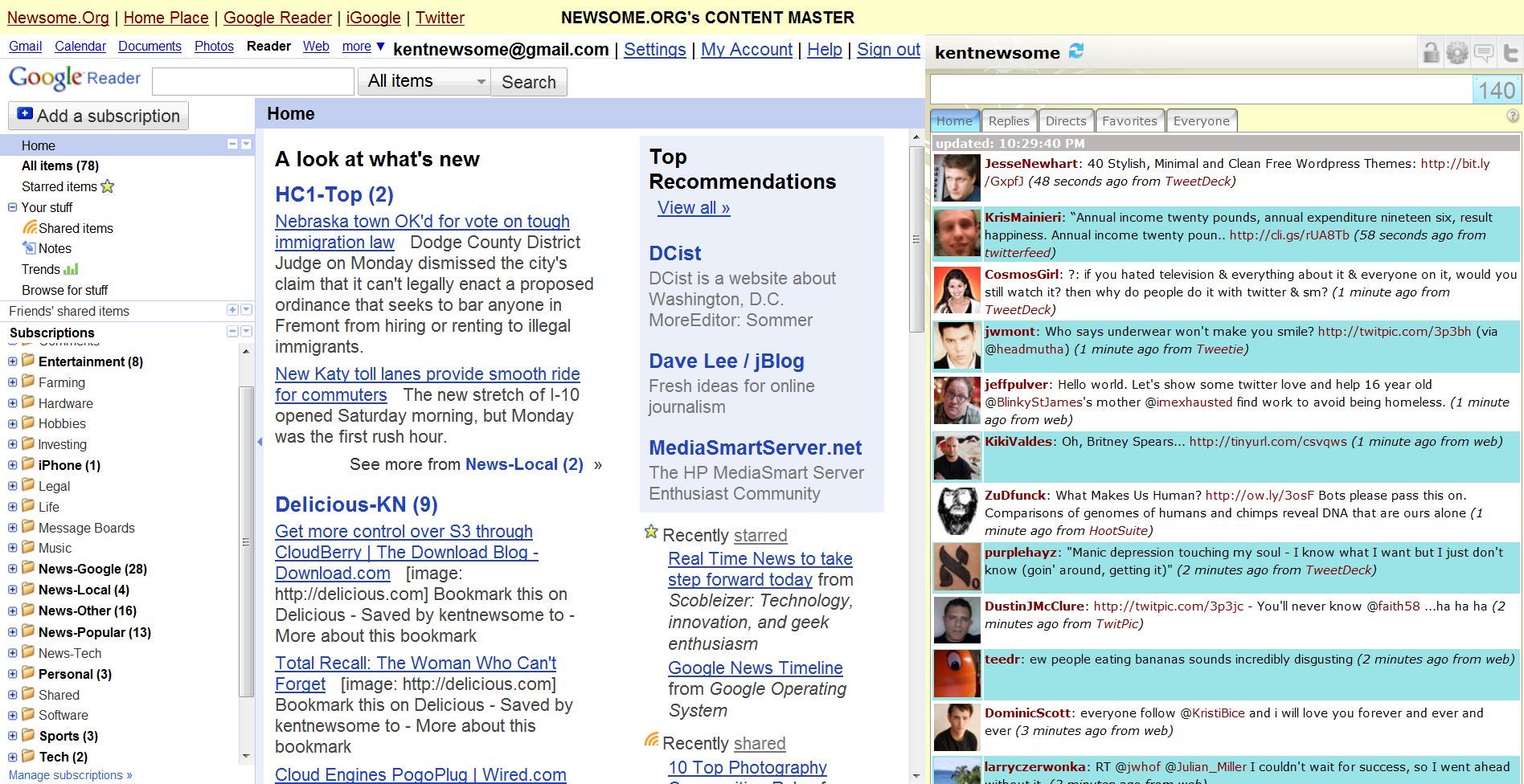
After trying several iGoogle hacks and scripts, some hand-written, I decided to trash iGoogle completely and do something I never thought I’d do again. I decided to use. . . a frameset. Why? Because by using frames, I could solve all four of the above issues, and enhance navigation too. By creating a frameset with a menu frame across the top, a 40% width TwitterGadget frame on the right and a 60% full Google Reader (not the gadget) frame on the left, I can do several things that improve my content reading, blogging and Twitter posting.
I can keep a TwitterGadget box open and always visible on the screen on the right hand side. This is critical for dragging links into the message box for commentary and posting.
By taking all of my content that was previously in the Google News gadget and the Feeds Tab Reader gadget and adding them to organized folders in Google Reader, I can access all of my content in one, unified window. If I am reasonably current in my feed reading, there is little need for scrolling, but if not I find scrolling to be preferable to stacked windows. All of this is done in a single instance of Google Reader and one instance of Twitter Gadget.
Because I now have the full Google Reader open in the left column, I can add items to my Google Reader shared items directly, instead of having to use the bookmarklet. Plus, I can access my starred items more easily.
And by having the Twitter Gadget in its own window, I avoid the annoying flashing/font reset problem.
In other words, I went through old school to get to new school.
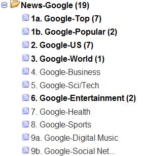
The drawback to Version 2.0 is that it requires some work to organize your feeds within Google Reader. I don’t always want my traditional news feeds to be in alphabetical order. For example, I want Google News “Top” items to be at the top, not the “Business” items. To solve this I added a numbering convention at the front of the renamed feeds (the ability to rename a feed being one of Google Reader’s best features).
I was also able to add a navigation bar at the top of the page to allow me to return to another of my most common destinations.

At the end of the day, I have a content reading and Twitter pushing page that is smaller, faster and easier to use (click the image below for a bigger view).
If you’re interested in experimenting with this setup, here is the frameset. You don’t have to have server space- you can open the file from your hard drive. If you don’t want to do that, you can use the Newsome.Org Content Master (Update: now depreciated) page. If you are logged into Twitter and Google, your information will appear in the appropriate windows. All I ask is that if you use that page, please Tweet about this post and subscribe to the Newsome.Org RSS feed.
There is still room for improvement. I would like to get rid of some of the screen waste on the Google Reader Home page, such as the entire right hand column, but all that unnecessary stuff is hidden once you start clicking on folders and individual feeds, so it’s not a huge problem. Additionally, Google needs to implement native column resizing in Google Reader.
What I really want is for TwitterGadget to add a feature to copy the headline, followed by a shortened URL (and not just the URL) when you drag a headline into the message box. That one feature would reduce Twittering time by over 50%.
Otherwise, I’m pretty pleased with this setup.
For now.
